Sometimes Cliché is Okay

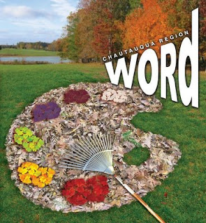
When faced with an illustration assignment in which you have NO source material, sometimes you have to improvise. This cover was for a FALL ART GUIDE, or some crap. I take full responsibility for employing the COMPLETELY cliché artist's palette. Sometimes the challenge with an over-used visual device, is to reinvent it in some way. I love concepts. This one... isn't really a stretch, but I think it gets there safely.
The execution on this was a bit rushed, but it works. I like the way the rake mimics a fan brush.
Sometimes an illustrator is just someone who creates a concept and "LEAVES."
Labels: autumn, chautauqua region word, cover, fall, leaves, rake


0 Comments:
Post a Comment
Subscribe to Post Comments [Atom]
<< Home